#trying to cover bases bc this ones a bit more graphic idk
Explore tagged Tumblr posts
Note
please tell me more about rikki’s style change in the 2000s… do you have any inspiration pics??
omg YES i would love to…..thank you anon…..more stuff under the cut (refs included!) also fair warning i’ve had a drink and i’m a little sleepy so i apologize if it seems ramble-y or half-baked BUT i really love this topic
so i base rikki’s style in the 1990s off of both faith no more-era mike patton and motley crue in the 90s. i wanted to get inspiration on both sides here lol but i did find myself looking more towards tommy lee’s style specifically, probably because pam anderson was one of my major influences when i designed nikki.
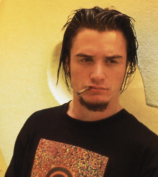
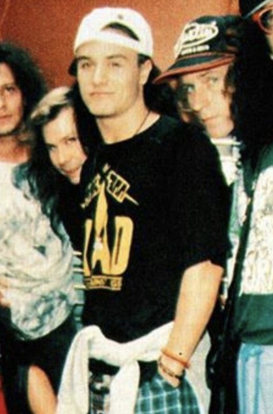
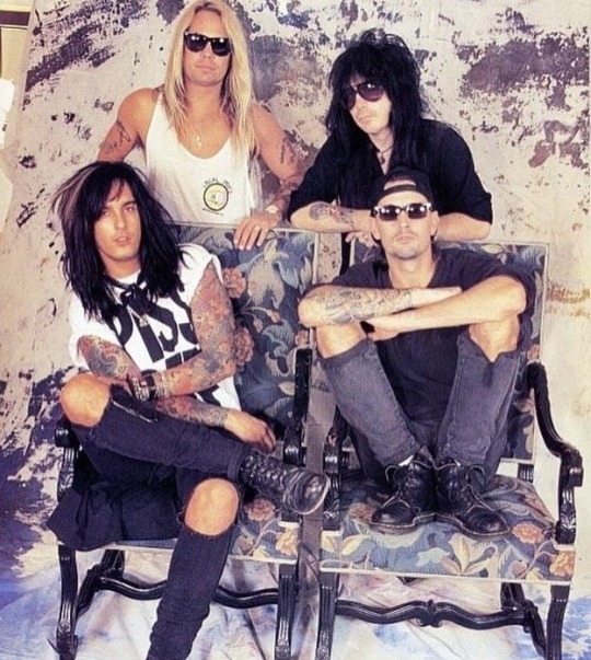
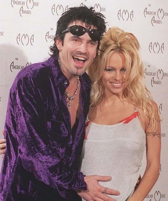
anyway so i wanted this just general cool guy appearance for young rikki. i wanted the “rockstar who doesn’t give a shit about the industry” look. and i’m just talking about everyday fashion here—i think he goes much wilder when it comes to things like big performances and public appearances/award shows/red carpet stuff/etc.
specifically his normal fashion includes things like darker clothes, tops that show off his tattoos, LOTS of chains/accessories, piercings, dyed and styled hair, facial hair, graphic tees, and typically not a lot of layers. overall he’s meant to come off as a Cool Young Dude you don’t wanna mess with.
the type of fashion that 90s crue had was pretty much in direct response to how glam metal had pretty much died with the 80s and was leaning more towards this new grunge sound that defined the 90s. you see the glam inspirations in the looks while still trying to look, well, more modern. idk it’s just interesting to me, and it’s fun to take inspiration from both that and fnm-era mike because he was arguably dressing much more like the aforementioned grunge guys were. so it’s fun trying to find a bit of middle ground when i’m clothing rikki here. overall though i still take more insp from the glam metal guys bc i just think that fits rikki more :^] AND it plays into how he dressed and markets himself in the 2000s.
speaking of. let’s talk about the 2000s. there was a style that emerged at this time that i think really was the perfect combination of the aforementioned styles. this was an aesthetic that had somewhat come out of early 2000s styles—styles categorized mainly by the emphasis on overindulgence, hyper-spending, luxury, and as a direct response to the minimalist designs of the time—and, while i don’t think there’s one agreed upon name, i’ve dubbed this mid-to-late 2000s look the “spikeTV look.” think bedazzled shirts and jeans, splatters, graffiti and tattoo motifs, and warmer colors. it has all the glam of the previous looks with the callbacks to grunge culture.
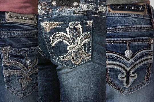
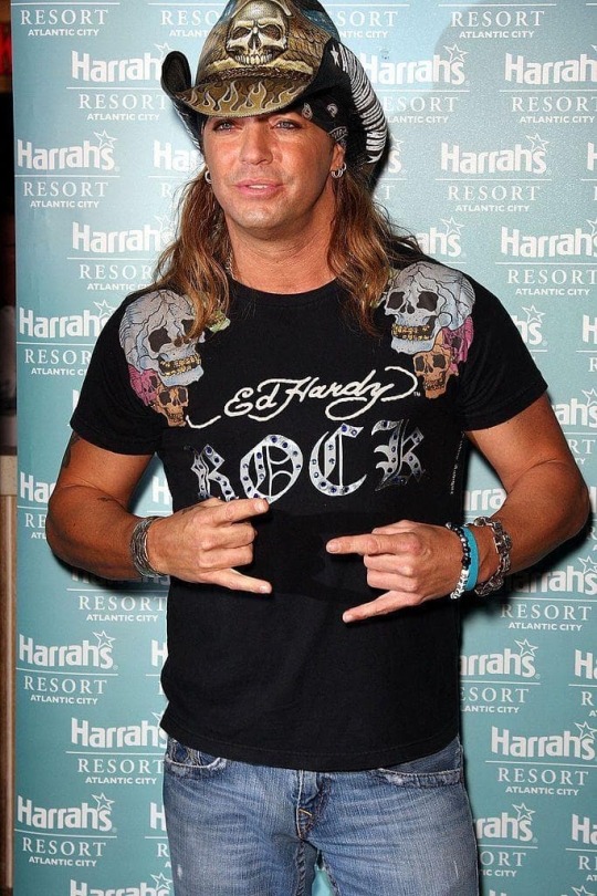

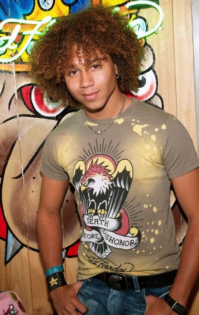
see, the thing about this look, is that i find it to be…….marketable. these looks became very popular, and i think designs along these lines feel very synonymous with the mid-to-late 2000s for a lot of people. it was almost like a watered down version of the luxurious, ultra decadent looks of the early 2000s—a more attainable, personable version of it to many people because……..do you know what happened in the year 2008, the year SnBII takes place? the recession. now i’m not about to sit here and figure out/debate on how THAT would work out in the context of the mtl universe at least not today but i will say that i do think that is something crucial to keep in mind when it comes to discussing this aesthetic and era of fashion and how it pertains to rikki.
rikki, at this point, is doing everything in his power to be relevant again. he’s purposefully selling himself as a brand for the first time, and he’s trying to be as marketable as possible in that respect. BUT the thing is, people know and recognize and love him as the bad boy rocker he was in the 90s, buuut also people (as in, the general public) aren’t really looking for That right now in this year 2008. so what better way than to look like a much tamer version of that? you still have the general Cool Guy look, but things are a little more covered up, you’re wearing warmer colors, and you still shine, but it’s not coming from your piercings and chains, it’s coming from the rhinestones on your ed hardy tee.
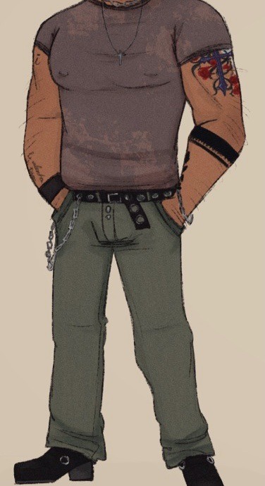

from an old timeline line-up thing. 90s on left, 2008 on right.
12 notes
·
View notes
Text
OKAY HERE ARE MY THOUGHTS ON WHAT I LIKED & DISLIKED ABT MALIGNANT. under a cut bc of spoilers (im not like outright saying the twists or story beats or anything im just covering my bases or whatever)
OKAY SO!!! things i liked:
THE COLORS i really liked the colors. i am kindof a sucker for dark teal and red lol & i also liked the yellow in the scene in the hotel(?) the colors were good. ok occasionally they were bit TOO muted & gray but overall i liked them!!
SOUNDTRACK i did really enjoy the soundtrack. joseph bishara you madman you've done it again!!
GORE... VIOLENCE AND KILLING!!!!! the gore mostly looked really good and cool!!! like the vast majority of gore shots were very fun i enjoyed them.
YUCKINESS!!! this goes with the gore but i also liked the yucky bits. if you've seen the movie i think u know what im talking abt lol.
THA KILLAR DESIGN!!! KILLAR MOVEMENTS... loved loved how the killer Looked and also how the killer moved around, VERY fun imo. but also -2 just bc EVERY time the killer was onscreen i was like "man this looks like a dbd character" and idk i dont want that to be at the front of my mind when im watching a movie.
TWISTS! i thought they were fun! idk they weren't the ending of saw (2004) or anything but they were enjoyable. but also idk not particularly hard to figure out imo
ok ummm some specific scenes i liked. the uhhhh attic moment. that one Violence Moment that had a lot of fun gore bits if you know you know. im trying really hard to be vague here
AND NOW!!! things that make it lose points (sorry mr. wan):
THE ACTING WAS. WELL. IT WAS ACTING. there were some line deliveries that made me laugh and i dont think they were supposed to? and even when they didnt make me laugh, there were several Very Serious Scenes that i just was yanked out of bc like. CHRIST man that person sure is acting. this isnt the greatest sin a horror movie can commit or anything but i wasnt a fan of that
THE WRITING COULD ALSO BE. WELL. WRITING! it was hard to tell when line deliveries felt weird bc of the acting or when the line itself was just weird. like i could NOT get emotionally invested in this movie im sorry if that was the intent but i couldnt do that. the last "i will always love you" thing was like. ok. yeah man. idk
THE UH. EFFECTS I GUESS? okay i really liked the gore effects mostly but also some of the more action-y sequences... well ik someone (i think remy carouselcometh iirc) described them this exact same way but they're correct so. videogame graphics. at times the movie had that videogame graphics look which i Do Not Like, it always looks SO weird and its all i can focus on for the rest of the scene. if your movie looks like the new uncharted for ps6 im sorry but i can only very rarely forgive that
sometimes the killer did look a lil goofy i cannot lie. USUALLY IT WAS COOL but sometimes i did laugh
90% of the women in this movie i honestly could not tell apart im sorry. like all of the white women blended together but ESPECIALLY serena & dr. weaver & madison.....
OVERALL IT WAS LIKE. yeah that was a movie! i'd recommend it to someone for the gore & killer design maybe but im not like emotionally invested which is a Big thing for me & movies. its the kind of thing i recommend to my brother basically lol
#personal#malignant spoilers#<- i tried to be as vague as possible though but like. tread lightly#and maybe just dont read if u wanna go into it totally blind
3 notes
·
View notes